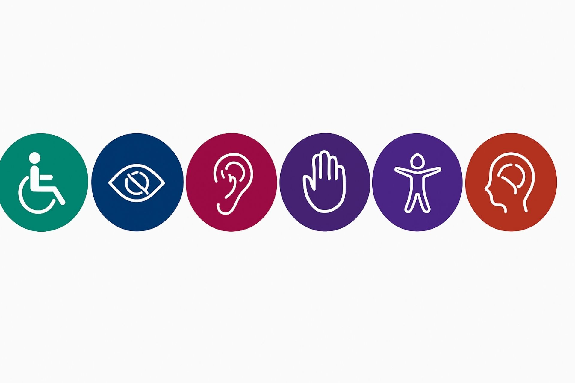
Accessibility symbols are an important part of inclusive design. These simple images help everyone quickly understand which spaces, services, or materials are designed with accessibility in mind. When we use clear and familiar symbols, it makes things easier and more welcoming for all users—whether they’re navigating a website, reading a brochure, or moving through a building.
Inclusive design isn’t just about how something looks; it’s about making sure everyone feels included and informed. Accessibility symbols speak a common language that helps break down barriers and shows that accessibility is a priority from the start.
In this guide, you’ll learn why these symbols matter, how to use them well, and how they help create a more inclusive experience for everyone—no matter their abilities.
Understanding Common Accessibility Symbols
Accessibility symbols are more than just icons. Accessibility symbols show a commitment to making things accessible for everyone.
These symbols help people with disabilities find their way around, ensuring they have equal access to information and opportunities.

International Symbol of Access (Wheelchair Symbol)
The wheelchair icon, known as the International Symbol of Access, is one of the most widely recognized signs in the world. It lets people know that a space or service is usable for those with mobility limitations. Using it properly matters—not just for clarity, but to support accessibility and meet disability rights requirements
Hearing and Communication Accessibility Symbols
Hearing and communication symbols show when services like sign language, captioning, or hearing loops are available.
These symbols matter for people who are Deaf or hard of hearing. They make it easier for them to get information and take part in events, services, and daily life.
Visual and Cognitive Accessibility Symbols
Visual and cognitive accessibility symbols highlight features for people with low vision or cognitive disabilities.
These symbols mark things like Braille signs, large-print materials, or easy-to-read information. Clear labeling makes spaces easier to navigate and more welcoming for individuals with different accessibility needs.
Why Accessibility Symbols Matter in Inclusive Design
Accessibility symbols are an important part of inclusive design. These symbols guide people on how to move around spaces and use services, both online and in person.
Best Practices for Digital Use
On websites and apps, icons help people with disabilities access features more easily. To make icons accessible:
- Use standard, recognizable symbols
- Add text labels that screen readers can read
- Make sure icons are easy to see and understand
Icons for adjusting font size, turning on high-contrast mode, or using a screen reader can make digital platforms much more user-friendly.
Using Symbols in Physical Spaces
In physical locations, accessibility signs should be easy to see, read, and reach. Most signs are placed between 48 and 60 inches from the floor.
Examples include:
- The International Symbol of Access (wheelchair icon) for accessible seating, entrances, or parking
- Braille signage for people who are blind
- Restroom signs that indicate accessible features
Good placement and simple design help individuals find what they need without confusion.
ADA Compliance and International Standards
Following the Americans with Disabilities Act (ADA) and international standards is more than a legal requirement—it supports equal access.
Using accessibility symbols correctly helps businesses, designers, and public spaces create environments that work for people with all types of abilities.
Conclusion
Accessibility symbols make digital and physical spaces easier for everyone to use. These symbols help people with disabilities access information, move around comfortably, and take part in everyday life.
Symbols like the International Symbol of Access (ISA) play a big role in promoting fairness and inclusion. The more accessibility becomes part of everyday design, the more people feel seen, respected, and included.
By including these symbols in designs, we take a step toward building a fairer, more respectful society. The more we spread awareness, the more natural accessibility becomes in everyday life—helping create a world where everyone belongs.
Need Help Making Your PDFs Accessible?
If you need help making your PDF files accessible, visit www.thorntonconsultingfirm.com. Thornton Consulting Firm specializes in PDF accessibility remediation services and can help ensure your documents meet accessibility standards.


This is very well written! I appreciate how clearly you explained accessibility in both digital and physical spaces. Maybe you could also include a short note about WCAG (Web Content Accessibility Guidelines) it would make the explanation even more complete.
Thank you for your feedback. I’ve noted your suggestion and will write a blog post on this WCAG. Thanks again